 Christian Schwartz has partnered with Paul Barnes to form Commercial Type, a new type foundry based in London and New York. Please click here to visit our site. RETAIL FONTS CUSTOM FONTS Please note that, except where indicated, these typefaces are not available for licensing. Publications: Amplitude Classified Amplitude Headline Big Black Book Stencil Brunel Caponi Farnham Headline Houston Kaiser (NEW) Popular Corporate Design: Bosch Deutsche Bahn Eero Empire State Building Harrison Munich Re Group Symantec UNFINISHED EARLY WORK ABOUT |
 1995-2008. Designed by Paul Barnes with assistance from Christian Schwartz. Available on a limited basis. Please contact Schwartzco Inc. for licensing information.
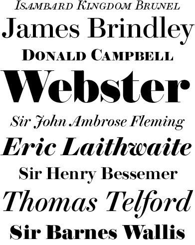
Brunel is an English modern; an anthology of the late eighteenth and nineteenth century English foundries. Drawing from original source material (most notably the Caslon foundry and the work of John Isaac Drury), it comes in a large number of weights, from the regular through to the fat face, and has been drawn in several optical sizes. Paul Barnes began work on this family in 1995, and I joined the effort in 2005, finishing the first round of styles for the launch of Condé Nast Portfolio. More information and better specimens can be found on Paul's site. (Wait for the animation if you want to see the full range of weights.) Final set of styles yet to be determined. |
|||||